Another Statistic

This is my mum some twenty years ago holding her grandson. This weekend you would have had her mentioned. Not by name but as one of the many who make up the statistics on those who were positive for Covid-19 and who died from it.

This is not a rant about numbers instead of people, it is about understanding what those statistics tell us. What I put above is factually true but it is not the whole truth.

My mum is around 70 in the picture above and she was 91 when she died. She has had a slow form of dementia which has slowly taken her from us for over a decade. She has been in a good nursing home for about two years because we were no longer able to look after her at home.

In the summer she started falling and was eventually fitted with a pacemaker and then in the early autumn she was admitted to hospital with a chest infection and while there fell and broke her hip. When she came out though she had a hip replacement she had forgotten how to walk and was very frail. The family at this point started a fight to stop further admittances to the hospital.

She was eventually put onto end of life care. We knew a chest infection would kill her. It would not have taken Covid-19 to do that, a common cold would probably have been as successful. In other words she was going to die anyway and we knew it.

Now when we compare ‘flu statistics with Covid-19 statistics we are not comparing like with like. The ‘flu statistics have cases like my mothers taken out, the covid-19 statistics do not. This means that the death rate for Covid-19 is inflated.

Do not get me wrong, not all deaths from Covid-19 are like my mums. That would be to jump from the heights of naivety to the depths of delusion. Some would, like my mum, have died anyway and some would not have died. If this pandemic is sorted by this time next year we will know how many extra deaths there were from Covid-19. However, my mum will not be one of them!

Not an Expoential Curve

Do people want some good news about Covid-19?

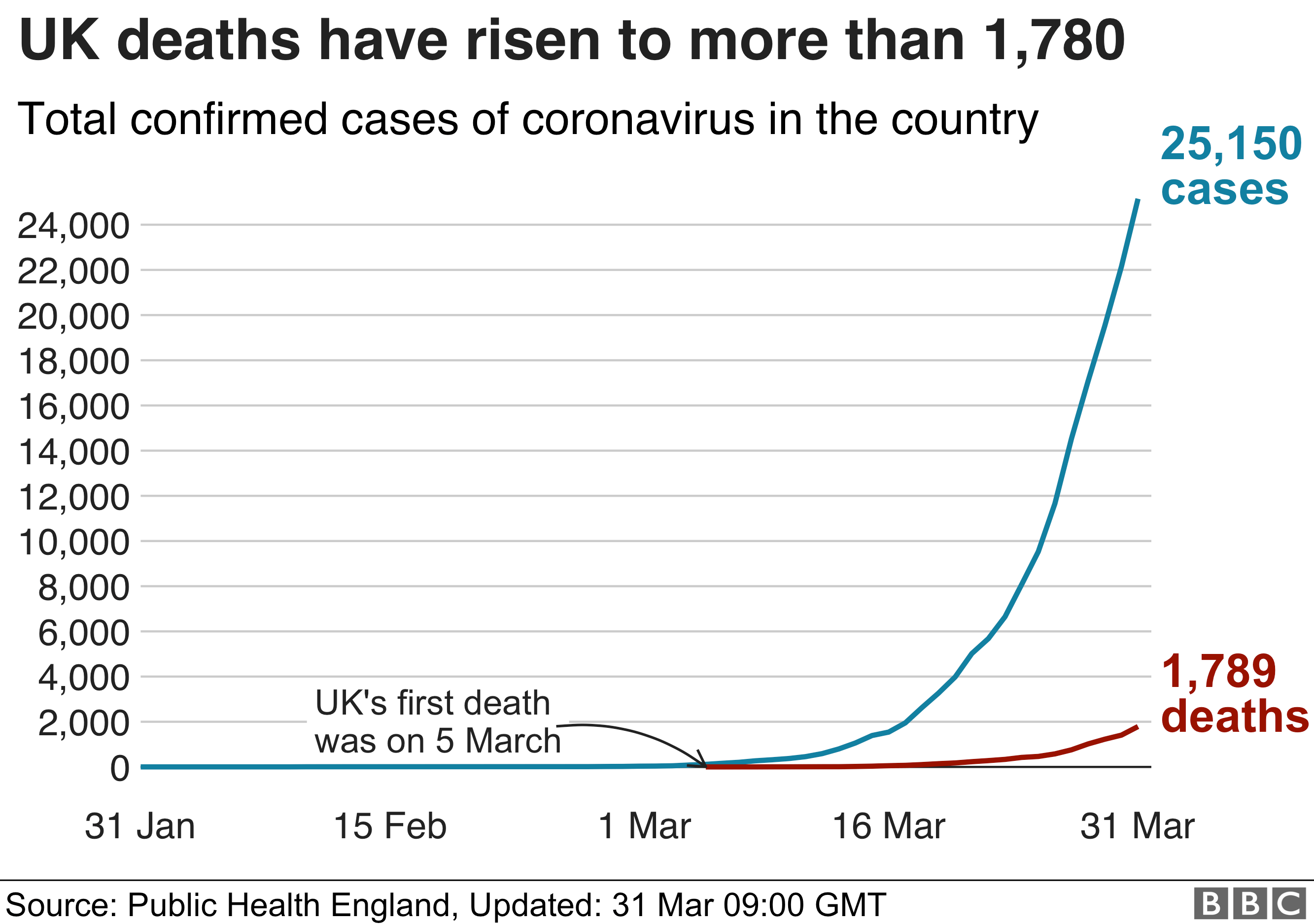
Well you will all have seen this scary graph in some form and be told it is exponential

https://ichef.bbci.co.uk/news/660/cpsprodpb/93EC/production/_111486873_uk_trend_chart_31mar-nc.png

Now the good news is that it is NOT exponential. It is a sigmoid curve,which basically has three stages:

  • an exponential start
  • a linear middle
  • an inverted exponential end (were it flattens to horizontal)

The good news is that I think we have got for the time being into the linear middle bit. This means that we will basically get the same number of new cases and death until something changes.

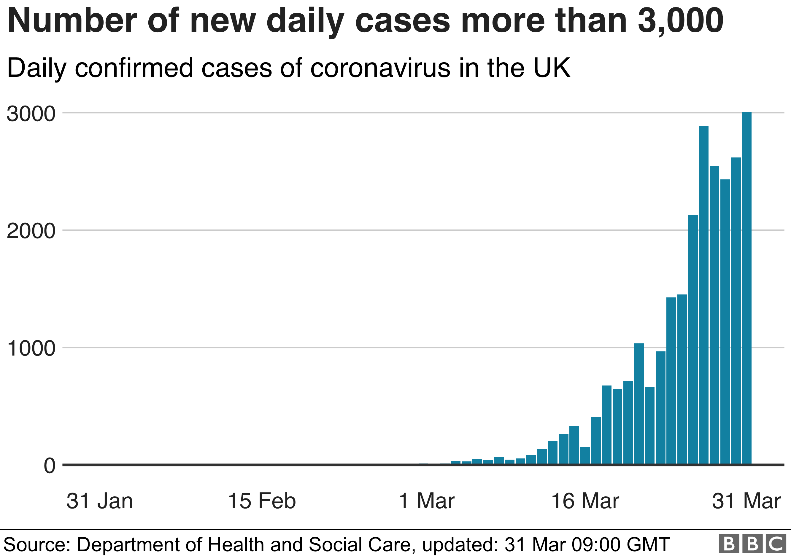
The graph of daily rates gives the same story:

Bar chart showing number of cases has gone up by more than 3,000

If you notice while we initially have an almost exponential looking increase over the last five days the increase has been small if not negligible. When that starts dropping we are in the final stages of the pandemic.

The continuous exponential curve is a false model. The population of the UK is large but it is definitely finite. With it being finite the exponential curve cannot continue. The exponential part occurs when the illness is new to a population that has no immunity. So each time a person with the disease comes in contact with someone else with the disease they infect that person who then goes on and infects all the people they meet. After a time, however, they start meeting people who have immunity from having had the disease among the people they meet. These people cannot get the disease again as they have the anti-bodies to fight the disease. This makes the curve change from an exponential to an approximately linear curve. When nearly everyone has had the virus and thus has anti-bodies then you start to get the inverted exponential curve of the end-stage.

Unfortunately, I think in current circumstances I do not think we are going to see the change into the inverted exponential end-stage just yet. I suspect one of three things will happen.

  1. We could see a broadening in the test criteria, this would lead to a jump in the number of positives because we are testing more people than we were before. The curve will become steeper but will remain basically straight
  2. We reduce social distancing too quickly. Basically, we have cut down the population available to the virus by our social distancing measures. As we reduce the social distancing measures we effectively increase the population to include new people who have not had the disease. If we ease restrictions too quickly it will put us straight back into the initial exponential part of the curve. We really do not want to do that until the daily rate of cases identified starts reducing and then we want to do it slowly and stepwise
  3. We remain in the straight piece for a very long time. This is if everything is managed well. We slowly lighten restrictions, allowing some people to go out more but at such a rate that the disease does not really get the chance to go off again.

So one battle won, but this campaign is going to contain many battles and everyone we lose will cost lives.

O for those who want to know what sort of curve it is, there is a variety of possibilities. The most usual one for statisticians is the logistic/logit but you can look at the probit, hyperbolic tangent and the arctangent. You can find a longer list on Wikipedia

Covid-19 Rates for local areas, taking population size into consideration

I got fed up with raw rates such as those given in the Guardian. For one thing, how can you compare the number of people infected in an area with nearly 1.4M (Hampshire) with the number in an area with less than 100K (Hartlepool). It simply does not make sense.

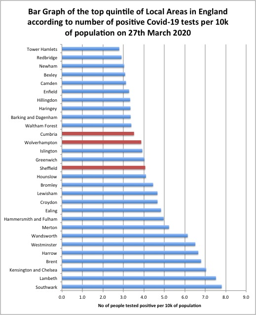
One way to correct this is to divide by the population size which I got from the government projections for 2020. Unfortunately the data, I found, only contained the figures for England. I took the rate per 10k of the population for diagnosis. The choice of per 10k of the population in a local area was made because of the number of positive tests at present if minuscule compared with the total population. It is a measure of population penetration of Covid 19. What I am going to produce below is a graph of the top quintile of local areas measured by the number of positive tests for Covid-19 per 10K of population

The average for London is 4.4 people diagnosed per 10K in the population, but that is heavily influenced by the high rates in Wandsworth, Westminster, Harrow, Brent, Kensington and Chelsea, Lambeth and Southwark. The median London Borough local area is Islington with 3.9. The rates per 10k for places outside London high : Sheffield (4.1), Wolverhampton (3.9) and Cumbria (3.5).

Now a warning. The positive tests are actually a pretty poor measure of population penetration. We are at present only really testing the very sick who need to come into hospital. This leaves a huge number with symptoms from a mild cough through to severe flu symptoms who are not being tested. If you then add in that Iceland found about 50% of positives had no symptoms then we are not really testing in any pattern that would pick up actual penetration. What is more, the rules for testing, I suspect, differ Health Authority to Health Authority and hospital to hospital, maybe even doctor to doctor.

There is a high rate of Coronavirus infection in seven London Boroughs out of 31 I could identify in the list. However when you compare infection rates over the whole of London you find that there are a few other places apart from London that seem to have a comparable list.

A side note: will all those who went to the Lake District last weekend please note how high it is on the list. You’d have been less likely to get Covid-19 if you had stayed at home.

Regression towards the mean, the scientific publishing culture and the lack of repeatability

A recent exchange on twitter the Thesiswhisperer wondered about why effects were disappearing. The feeling is this should not happen with the modern scientific culture, and yet I suspect modern academic scientific culture is partly to blame. To explain why I have to introduce a little known but rather simple statistical fact which may be called Regression towards the mean.

Let me do it by given a common example used in teaching regression towards the mean. The lecturer tells a class that he has the ability to improve people psychic ability. He then writes on a piece of paper a number between 1 and 100 without showing the class. He then asks the class to write down what they think the number is. He then reveals the number and asks to class to tell him how well they did.

Now the experiment starts. He takes a sample from the class of people who got furthest from his value, say the worst half. He points out these are obviously the less psychic to show the effect. With these he performs some ritual, perhaps to stand up turn round three times and say “esn-esn-on” (“nonsense” backwards).

Then he repeats the experiment but this time with only this worst half and low and behold, they perform better. That is there average guess is closer to his value than they were in the previous study.

The lecturer then admits there is no psychic ability involved in this, so what is going on. The trick is in the selection. Indeed if he looked at the Standard deviation for the whole class at the start and the standard deviation for the sample in the second they should be of approximately the same size. People are pretty randomly choosing their number, those who guess badly at first do that pretty randomly and actually if he had taken the full class the performance would have been much the same as before, only the ones who did better would have differed.

Regression to the mean basically means that if there is a selection bias in a distribution as fresh data is produced this will tend to go back towards the mean.

So what has this to do with non-repeatability. For starters I am not belittling this phenomena I have been involved in studies which aimed to replicate a previously carried out study. The prior study reported a huge effect so the power calculation required a small sample size, indeed so small we upped the numbers just to persuade the ethics committee that this was a genuine attempt to replicate. This only to find when we have the data collected that there is no effect visible in the data. So I have experienced non-repeatability.
Nor am I accusing researchers of bad practice. They are honestly reporting the results they get. It is the ability to report the results, i.e. the selection process by journals that produces the phenomena!

Published results and accepted results aren’t just a random sample of all results. They are selected for the results that demonstrate a genuine effect. They particularly like those results that are significant at p=.05 level. However gaining a p-value of less than .05 (or any value) is no guarantee that you have a true effect. For a start off with p=.05, one in twenty of results where there is genuinely no effect get reported as having an effect. Now that isn’t one in twenty of reported results (it might be lots higher or lower) but one in twenty of results where there is NOTHING is genuinely happening. Unfortunately we don’t know where these one in twenty are. It looks like a result even though it there isn’t an effect. We know there are type 1 error, our selection for criteria for publication reports allows one in twenty papers through where there is genuinely no effect.

But what if there is an effect? Well we are more likely to detect it if our sample happens to over-estimate the effect than if it under estimates the effect. In other words there are studies out there where there was a genuine effect but it did not get published because they drew a sample that performed badly. On the other hand on well designed experiments all the studies that draw fortunate samples are likely to significant. So the tendency is to over estimate actual effects because the selection criteria for publication favours those who draw fortunate samples.

This is not news, I have not suddenly found this inspiration, look there are learned reviews exploring this very topic. There are approaches when results start behaving in this way, one is to look at the sample size it would take to detect a difference between the original results and the fresh results, and if that is larger than the two studies then it may well be just the result of regression to the mean. It is also why clinicians are moving towards Meta Analysis rather than the results from just one study, but meta-analysis itself is hampered by the publishing bias.

I also want to sound a warning, skewed data (data where a few people produce very high scores) can quite easily produce odd ball results. This causes problems when sampling, there are statistical methods for analysing this but I have rarely seen them applied out side the statistical class room.

So yes I would expect the published results of effects on the whole to be over-estimates. The over-estimation is a product of the current scientific publishing culture. There are some approaches to alleviate this problem but at present no cure because the cure involves a change of culture.